I started in a sketch book, but once I got a general idea going, I moved to Illustrator to work on the branding for Nummy’s Ice Dream. The first step was settling on a logo and color palette
Like with most of my work, I started in black and white. This helped me focus on the shapes and values without getting distracted by color. Once I was happy with my ice cream cup logo I moved on to colors.
I chose this color palette because it reminds me of the richness of baked goods. I want this brand to feel indulgent, so I went with a rich yellow and pink, and then used lighter pastels to balance things out, this is still ice cream after all :)
On to fonts!
Choosing a typeface for the brand was probably my favorite part of the process. I looked at packaging for both regular dairy ice cream as well as specifically non-dairy brands.
I ended up choosing Domus as the main font for the logo and general information. I like that it’s clean and fresh, but also has soft, rounded edges.
While I love the way Domus worked for this brand and was happy with it as the primary font, I wanted to use a secondary font for the flavors to add a little more pizazz. Here, I revisited the fonts I had gathered and tried pairing them with Domus.
I looked at my inspiration board and tried finding font pairings that fit the product, was easy to read, paired well with Domus, and most importantly fit the Nummy’s Ice Dream brand.
Ultimately, after some soul searching and getting feedback from trusted friends, I went with Pacifico.
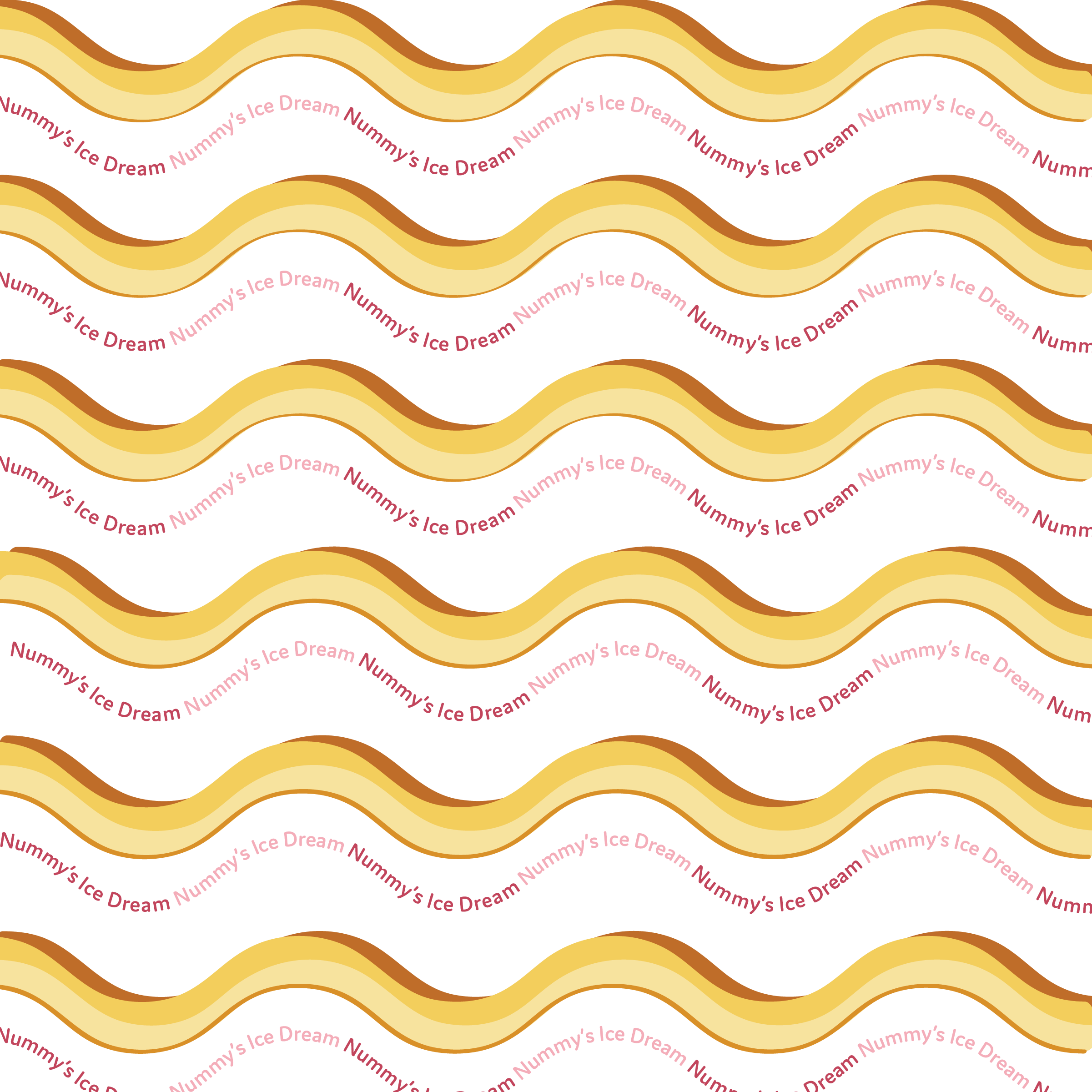
A final thing I wanted to have on hand was a pattern to use on the pints, cones, and any apparel that I might want to make down the line. I experimented with a few things. The main thing I wanted from the pattern was to capture the roundness and indulgence of the logo and colors. I ended up with these 3, so far I’ve been using the third one primarily.


